Creating a Custom Button Component in React
When you are frequently using buttons in your React project, it makes sense to create your own button component. This greatly improves code quality because it allows you to reuse the same styling for all buttons across your project.
In this tutorial you will learn about:
- Creating a custom button component
- Accepting all standard HTML button attributes via props
- Adjusting the component to use TypeScript
Creating a Button Component
Start off by making a file for your custom button component. I will call it CustomButton.jsx, but you can name it anything you want.
This component should do the following things:
- Return the HTML
buttonelement - Accept a
childrenprop that will hold the content of the button - Allow standard button attributes to be passed through props
export default function CustomButton({ children, ...attributes }) {
  return (
    <button type="button" {...attributes}>
      {children}
    </button>
  );
}
You can use the rest operator (…) to gather all props you pass to the CustomButton into attributes prop. You can then spread these props with ...attributes into the HTML button element. This way, you can pass all standard button attributes such as type, onClick and so on to CustomButton.
By default, the button element has a type of submit. You will likely use buttons outside of forms most of the time, so it makes sense to set the type to button.
You can now add some styling to share same look for all buttons across your project.
For example, here I am adding some Tailwind CSS classes to style my button.
export default function CustomButton({ children, ...attributes }) {
  return (
    <button
      type="button"
      className="border border-gray-800 px-4 py-2 rounded uppercase"
      {...attributes}
    >
      {children}
    </button>
  );
}
Using the Button
Now that you have made a custom button, you can use it anywhere in your project.
export default function App() {
  return (
    <CustomButton>Click me</CustomButton>
  );
}
Of course, buttons are not useful if they don’t do anything. Pass your button an onClick event handler function.
export default function App() {
  function handleClick(event) {
    console.log(event.target);
  }

  return (
    <CustomButton onClick={handleClick}>Click me</CustomButton>
  );
}
Or, override the button type to turn it into a submit button for a form.
<form>
	<CustomButton type="submit">Submit form</CustomButton>
</form>
Again, passing these native attributes is possible thanks to CustomButton spreading its props into the button element with ...attributes.
Adding Icons
Because you are using children prop in your CustomButton component, you can pass your button any element you want, including other components.
This means that adding icons can be done by wrapping them inside the CustomButton tags just like regular text.
Here I am using React Icons library, which lets you add all sorts of icons to your project.
import { FiArrowDownCircle, FiPlus } from 'react-icons/fi';
import CustomButton from './components/CustomButton';

export default function App() {
  return (
    <>
      <div className="flex gap-4">
        <CustomButton>
          <span className="flex items-center gap-2">
            Add Item
            <FiPlus role="presentation" />
          </span>
        </CustomButton>

        <CustomButton>
          <span className="flex items-center gap-2">
            <FiArrowDownCircle role="presentation" />
            Download
          </span>
        </CustomButton>
      </div>
    </>
  );
}
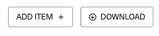
This will render two buttons containing icons.
Using TypeScript in Custom Button Component
Now that you know how to create your own button component and customize it to your needs, you can take it a step further with TypeScript.
You can add your own Props interface that extends HTMLButtonElement props. Don’t forget to describe the type for the children prop too.
import React from 'react';

interface Props extends React.ButtonHTMLAttributes<HTMLButtonElement> {
  children: React.ReactNode;
}

export default function CustomButton({ children, ...attributes }: Props) {
  return (
    <button
      type="button"
      className="border border-gray-800 px-4 py-2 rounded uppercase"
      {...attributes}
    >
      {children}
    </button>
  );
}
Thanks to code in line 3, your should see suggestions for all sorts of HTML button attributes when you use your custom button component.
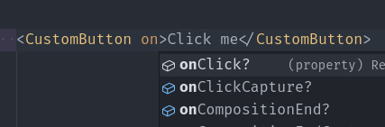
This greatly helps when you don’t remember the attribute names exactly.